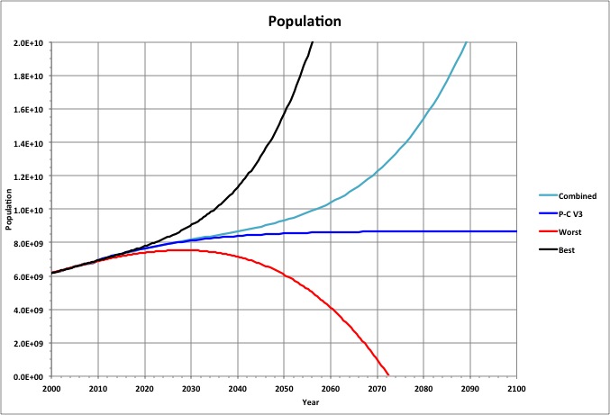
Worst and best case polynomial curve fits (to the sixth-order) of world population are shown here, along with P-C V3, based on data from 1900-2010.
A PERT estimate based on these three projections (Combined) is also shown, calculated as follows:
Combined = (Worst + Best + 4 * Mode) / 6
where P-C V3 is used as Mode.
Note that the Combined value for 2050 is the same as that projected by the United Nations.
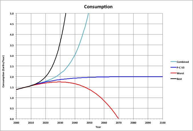
Projections for world consumption using the ecological footprint as a proxy for per-capita consumption) are shown here, using the same definitions as for population (above), except that the data used is the PC-V3 projections for 1961-2010.
Note that the value of Combined for 2050 is 3.3 times that of its value for 2010, which is fairly consistent with United Nations consumption projections (cited above).
Also, the peak for Worst is 87% of the peak for P-C V3.
Roll-over the image to see a closer view.
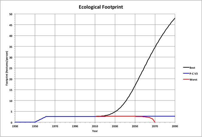
The Best population and consumption projections result in a steadily increasing per-capita consumption (measured as the ecological footprint), while P-C V3 levels off and the Worst case increases to a maximum and then drops to zero.
Roll over the image to see a close-up.
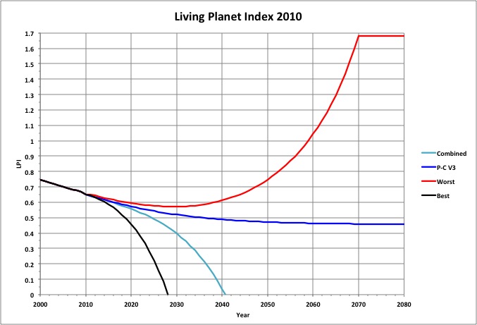
The Living Planet Index (LPI) is a measure of the populations of other species. Assuming it is related to consumption in the same way as our population is related to our consumption in P-C V3, and that the sum of the consumption by humans and consumption by other species is a constant, then it is projected to change as shown.
Roll over the image to see more of the projections.
LPI is correlated with maximum population and consumption for the worst case. See Maximum Consumption.
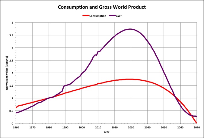
The Gross World Product (GWP) for the Worst case is expected to correct its trajectory soon and increase to a peak corresponding to peak consumption. Here, both Worst consumption and GWP are shown normalized to their values in 1980 (1.0 Earth and $27.19B, respectively)
GWP data in 2009 dollars is from the Earth Policy Institute (Gross World Product, 1950-2009).
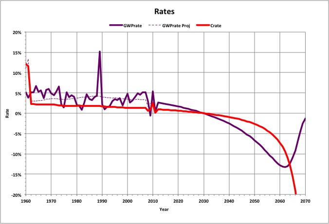
The annual rate of change in consumption has been decreasing while the GWP rate has been far more volatile but headed in the same direction. If the GWP continues to track with consumption as it has, and consumption follows the Worst trajectory, then economic conditions will only get worse.
Note that the GWP rate projected using the curve fit to consumption (dotted line) indicates that the rate peaked in 1989, where the largest spike occurred.
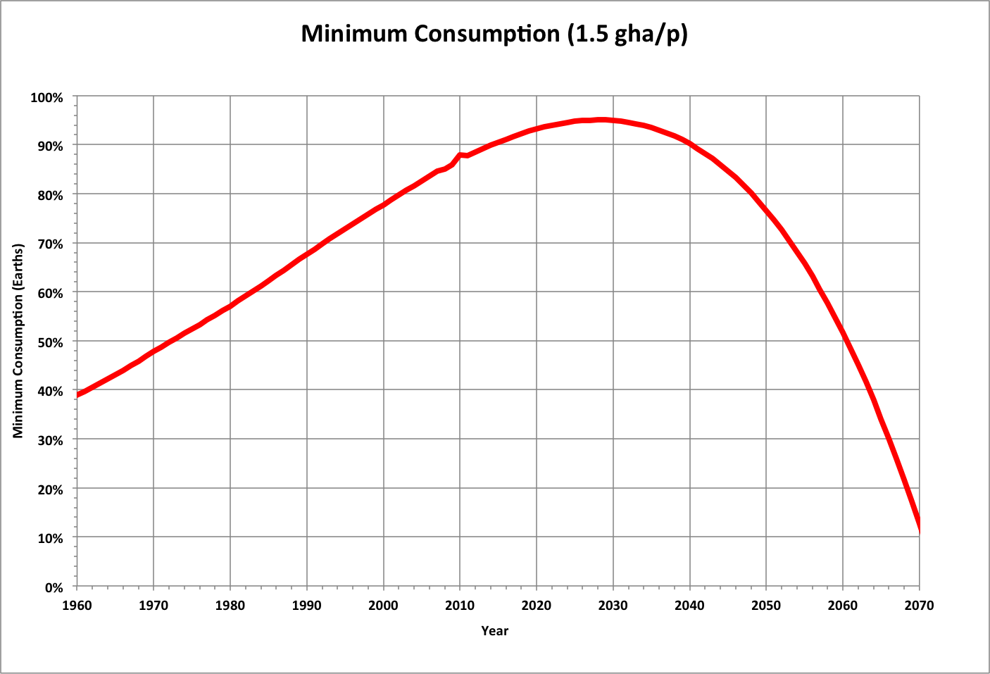
Each year we wait to reduce consumption, the minimum total consumption (at per-capita consumption of 1.5 global hectares) approaches 1 Earth. By the time population peaks, (for the Worst case), total consumption will be within 5% of 1 Earth.
If we cut back today, we would have a margin barely large enough for other species to use. Decreasing that margin makes it more unlikely that we will find a sustainable way to maintain a healthy civilization.