Timelines Model (V3)
Version 3 of the Timelines model simulates populations using random "regions" rather than normal statistical distributions, but uses the same underlying variable relationships as the previous version with new corrections for wealth and inflation ($Convert).
The following graph shows the relationships between global variables tracked in the Timelines model.
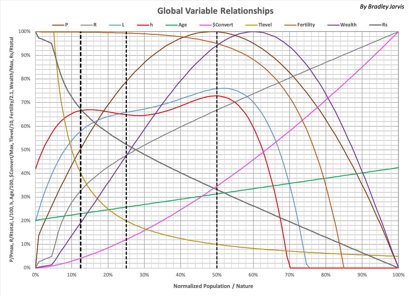
Variables are as follows:
| P | World population (normalized to maximum number of people) |
| R | Ecological resources consumed per year (normalized to total resources) |
| L | Average life expectancy (normalized to 100 years) |
| h | Average happiness (value in %) |
| Age | Median age (normalized to 100 years) |
| $Convert | Global inflation of U.S. dollars as fraction of value in 2010 (normalized to maximum) |
| Tlevel | Trophic level (members of standard other species per person, normalized to 10) |
| Fertility | Surviving children born per woman (normalized to 2.1) |
| Wealth | Wealth in U.S. dollars (2010 value) |
| Wealth/p | Average wealth per person |
| Rs | Remaining ecological resources (normalized to total resources) |
| Rtotal | Total ecological resources in the world |
| Normalized Population / Nature, Sr | Ratio of minimum consumption by people and other species (P / Rs, normalized to maximum 1.126) |
Black dotted lines indicate where "stages" of development are crossed in what can historically be considered as humanity's lifecycle. These stages are defined as ranges of Sr below, along with "phases" of development based on history and the best fit to the future (Timeline 2).
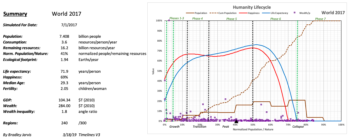
The number of people in each phase is simulated using 300 regions defined by randomly selected values for P, Rs, and Rtotal. One such simulation is shown below for the world in 2017, indicating the distribution of population and Wealth/p for each region (normalized to the maximum). A curve fit toWealth/p (dashed purple line) is also shown., along with theoretical values of happiness and life expectancy. A black triangle on the horizontal axis indicates the average value of Sr for the population.
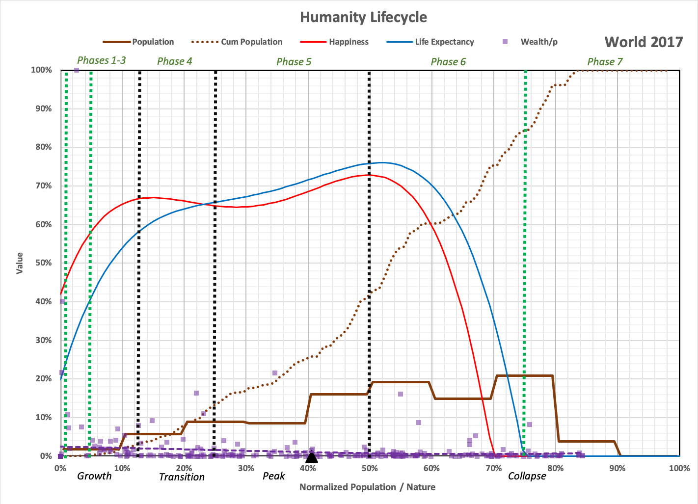
Note that regions with no people are not shown. In this simulation, 60 of the 300 are uninhabited with no remaining resources.
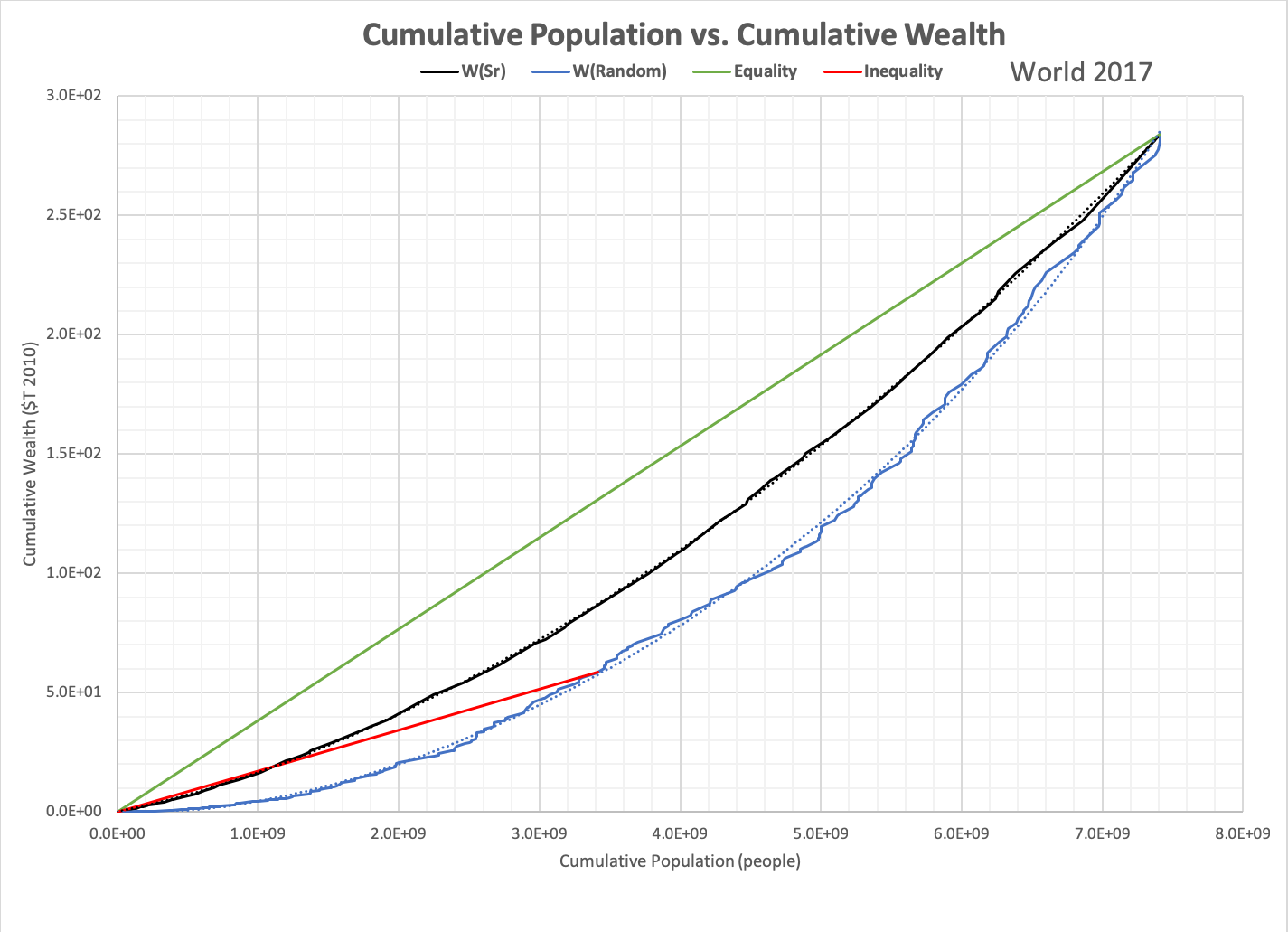
While wealth inequality is roughly indicated by the distribution of regions for Wealth/p, it can also be measured using a graph of cumulative population vs. cumulative wealth as shown below for the world in 2017. The graph shows how wealth per person depends on how it is grown in a chain of regions, each with its own population and consumption. Since wealth varies with population times total consumption (resources traded between all people) - roll over the graph to see how - the distribution of consumption throughout the chain has the most impact on inequality.
Three examples of wealth distribution are shown. The green line indicates pure equality (everyone has the same amount of wealth). The black line indicates how wealth would be distributed if the chain was organized based on population/nature. The blue line indicates a random chain (this chain best matches historical data).
A red line is drawn to the point of average difference between the curve and the equality line, indicating an angle that can be used to measure inequality, where [angle of green line to the x-axis]/ [angle of the red line to the x-axis] = inequality.
See also the Simulated News blog, which is a fictional treatment of the model that includes "Reality Check" discussions of the underlying research.