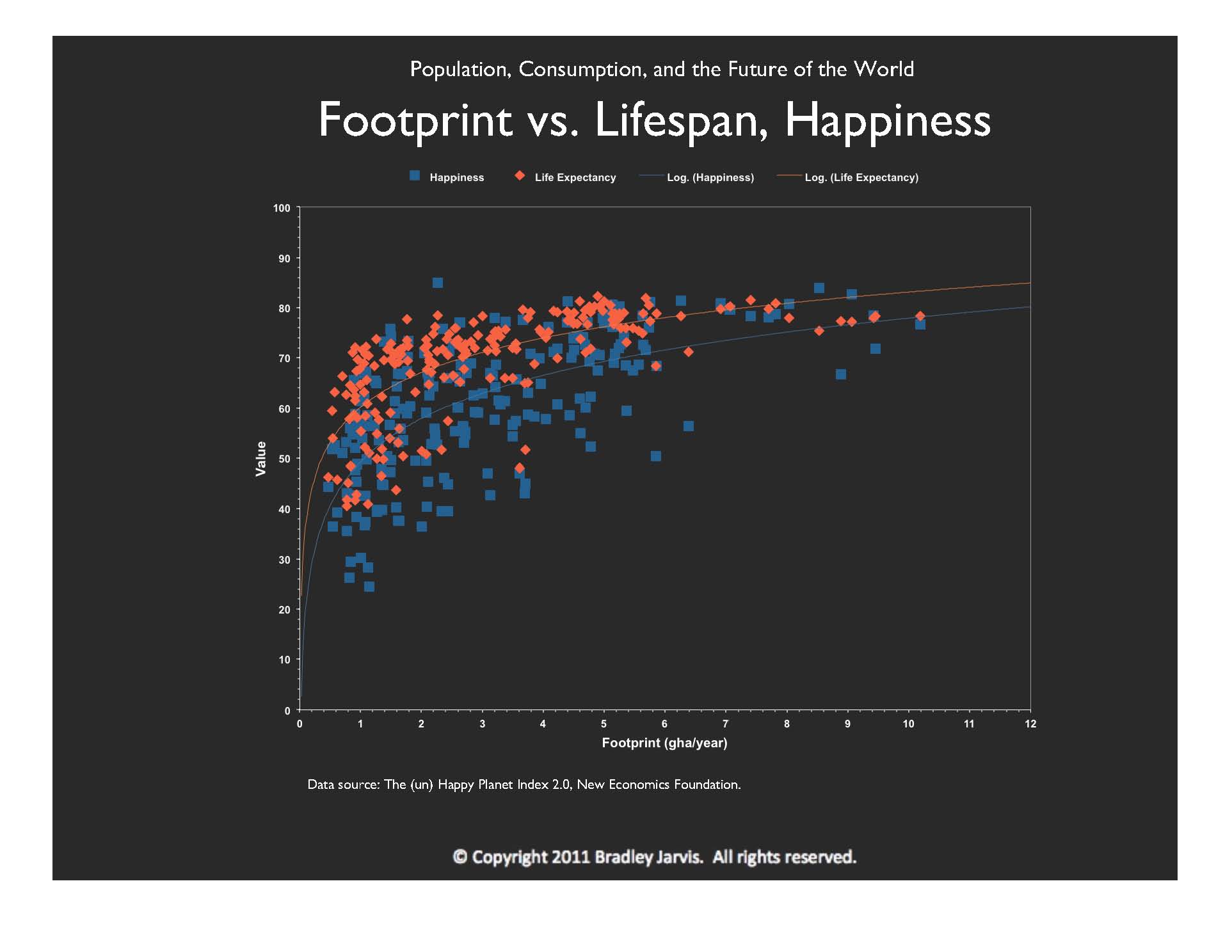
This graph, based on data from 144 countries, some over time, shows that quality of life improves with how much we consume. Both lifespan and happiness vary logarithmically with ecological footprint, represented by the solid lines.
Recall that a logarithm is the same as the exponent of a number called the "base," that together equals another number. For example, the logarithm of 100 is 2 for a base of 10, because 10 raised to the second power equals 100.
Clearly, the more we consume, the less of an incremental gain in lifespan or happiness we attain.
You've probably heard that happiness actually goes down as we consume more. That is the case only when we use money as a measure of consumption, which is a function of our economy.
One more thing about this graph: because both lifespan and happiness vary logarithmically, their relationship to each other is linear. That is, if you were to plot one against the other, you would have a straight line.
© Copyright 2011 Bradley Jarvis. All rights reserved.