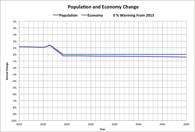
Futurecast
The model for Backcast Version 2 can be used to project future scenarios based on anticipated effects of global warming.
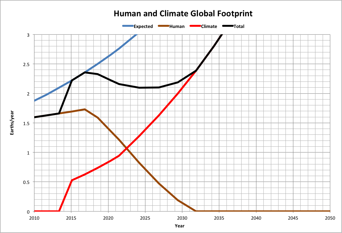
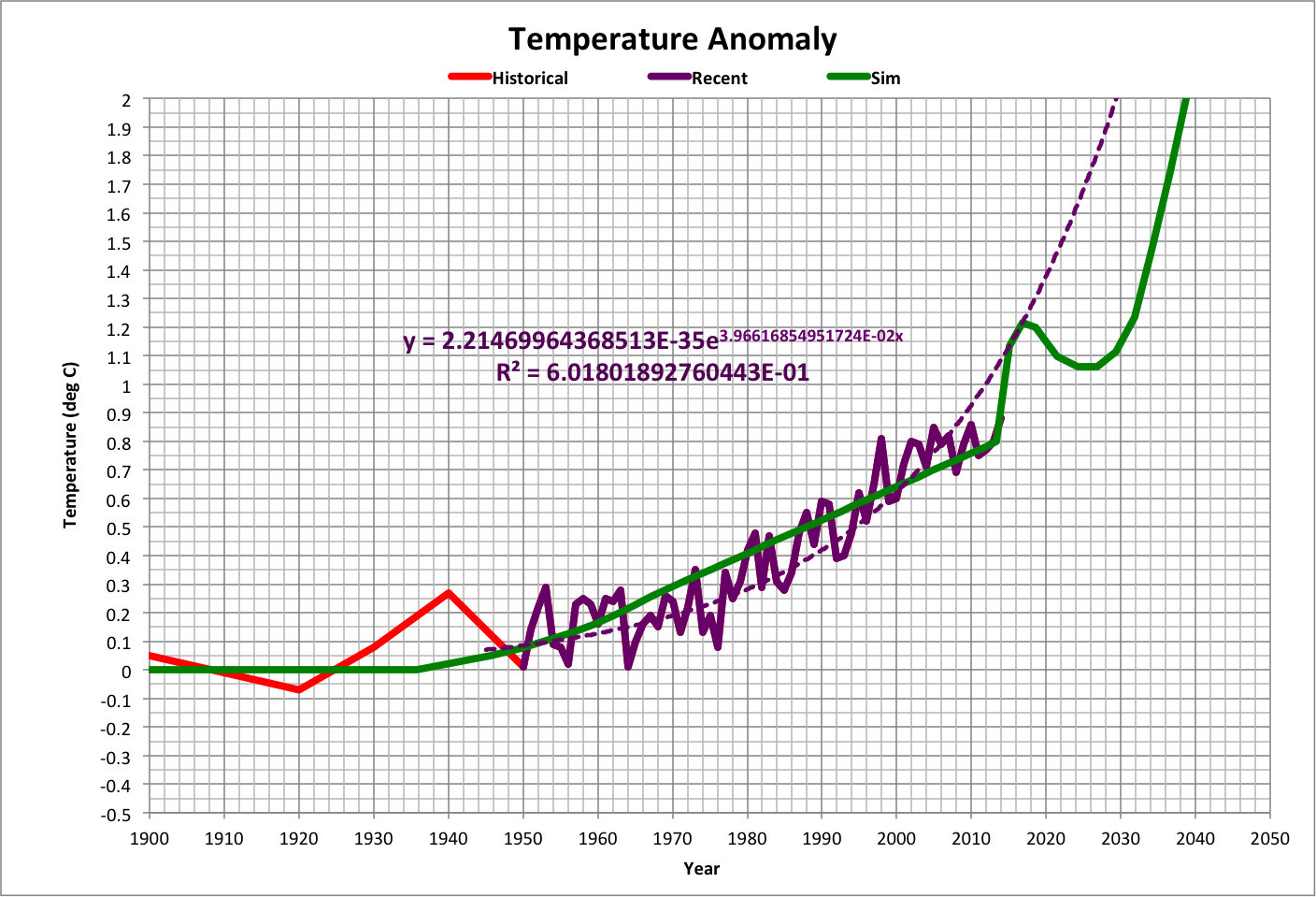
The following graph shows average global temperature (difference from the Industrial Revolution), and a projection of temperature based on recent data that best matches current and expected temperature rise (as of March 2016). Sim uses the backcast model to show anticipated temperature after human response to the effects of 100% self-sustained global warming as described below.
Note that in this and other graphs, years are marked at mid-year.
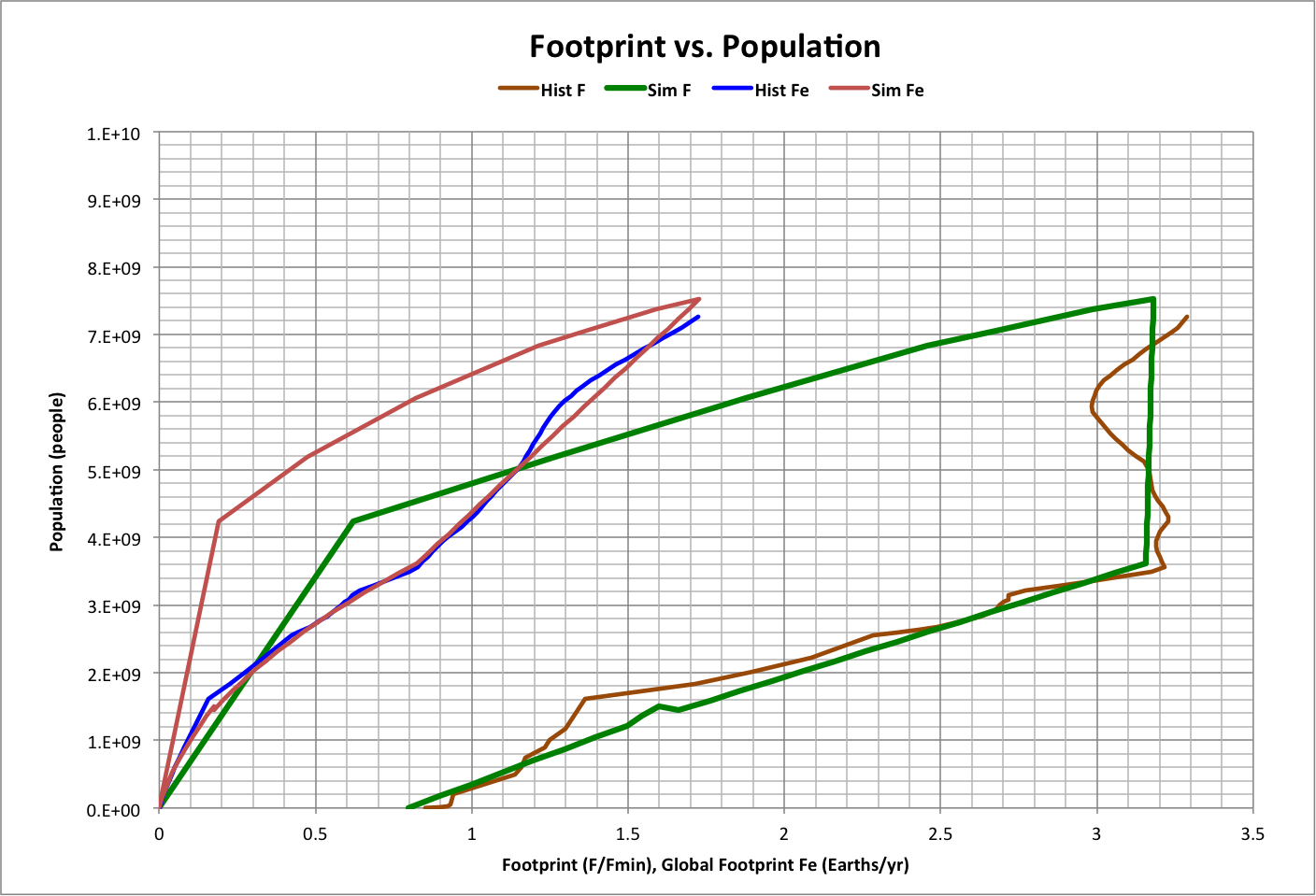
Self-sustained global warming is expected to have an effect on ecosystems similar to the human global footprint Fe. This is modeled using the observed correlation between temperature and Fe (roll over the graph above to see this correlation).
Assuming that self-sustained global warming begins in a given year (StartYear), then its global footprint FeTemp is a fraction (ClimateFraction) of the difference between what the global footprint would be with maximum temperature rise (FeAll) and the value of Fe in StartYear:
FeTemp(year) = ClimateFraction * [ FeAll(year) - Fe(StartYear) ]
The following graph shows these values for 100% self-sustained warming (ClimateFraction = 1) beginning in 2015 (StartYear = 2015), where:
- Expected is FeAll
- Human is Fe
- Climate is FeTemp
- Total is Fe + FeTemp
Note that the maximum amount of resources on the planet is ~ 3 Earths/year, which means that human extinction is certain at that point.