Half-Earth Hypothesis
This page presents the mathematical reasoning behind the "Half-Earth Hypothesis," which is based on work done on version 4 of the Population-Consumption model.
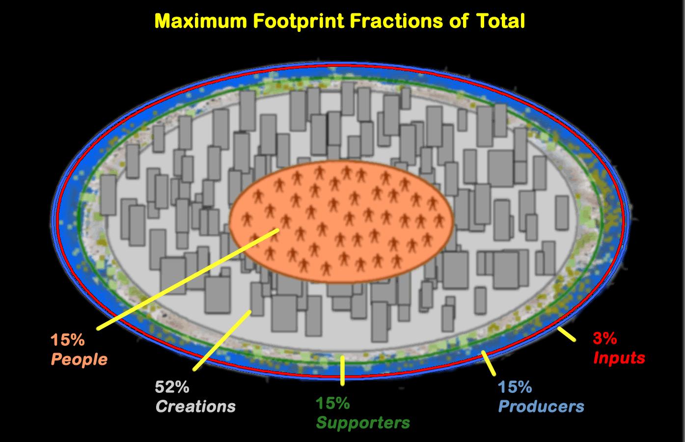
Some definitions are illustrated in the following diagram:
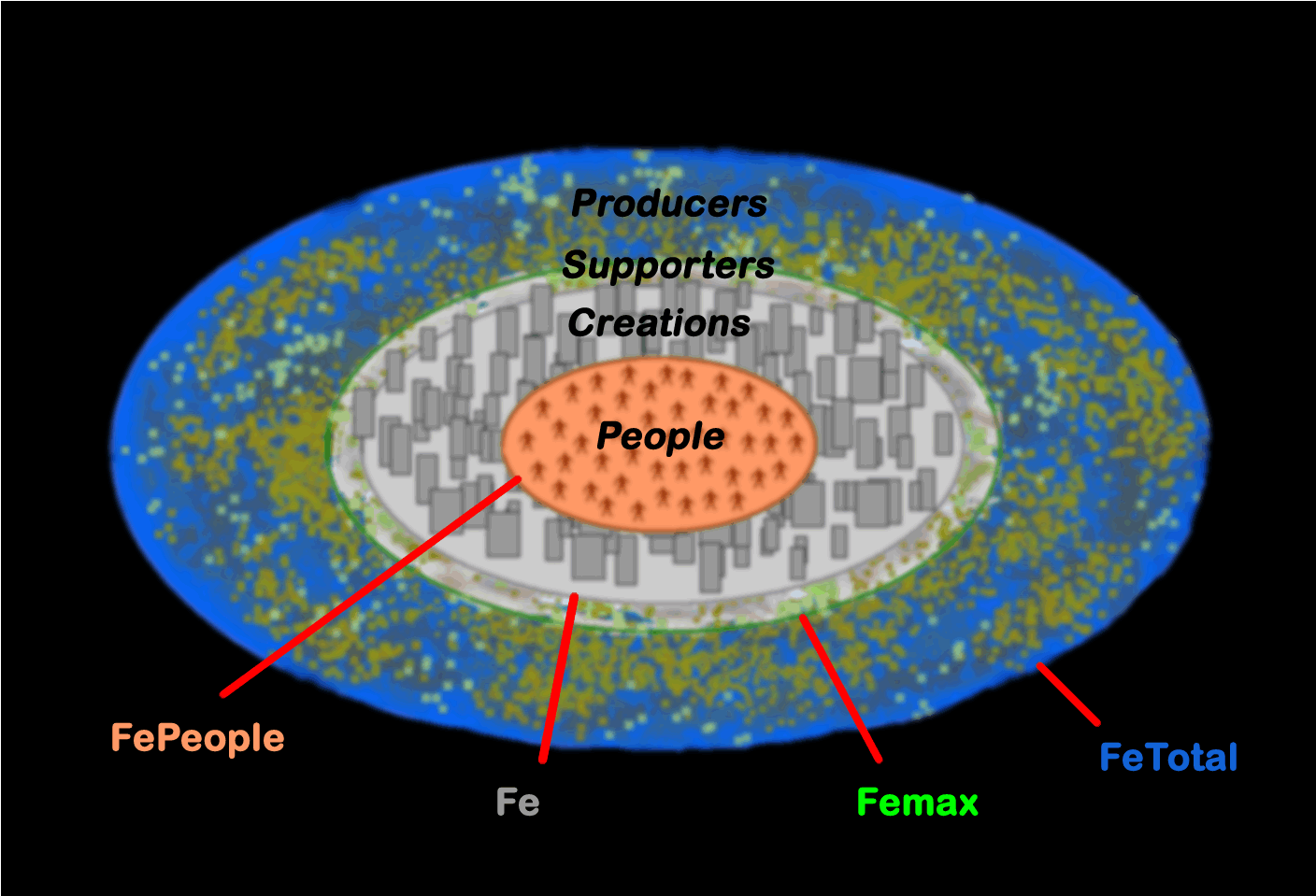
The "global footprint" Fe is the sum of the ecological footprints of everyone on Earth (population Ppop), which includes the minimum footprint of the population (FePeople = Ppop * Fmin):
Fe = Ppop * F
The "maximum global footprint" Femax is the total footprint plus the total footprint (Femin) of the part of Nature associated with the minimum footprint (that which provides what we need to survive):
Femax = Fe / Fratio = Ppop * (F + Fmin) = Fe + Femin
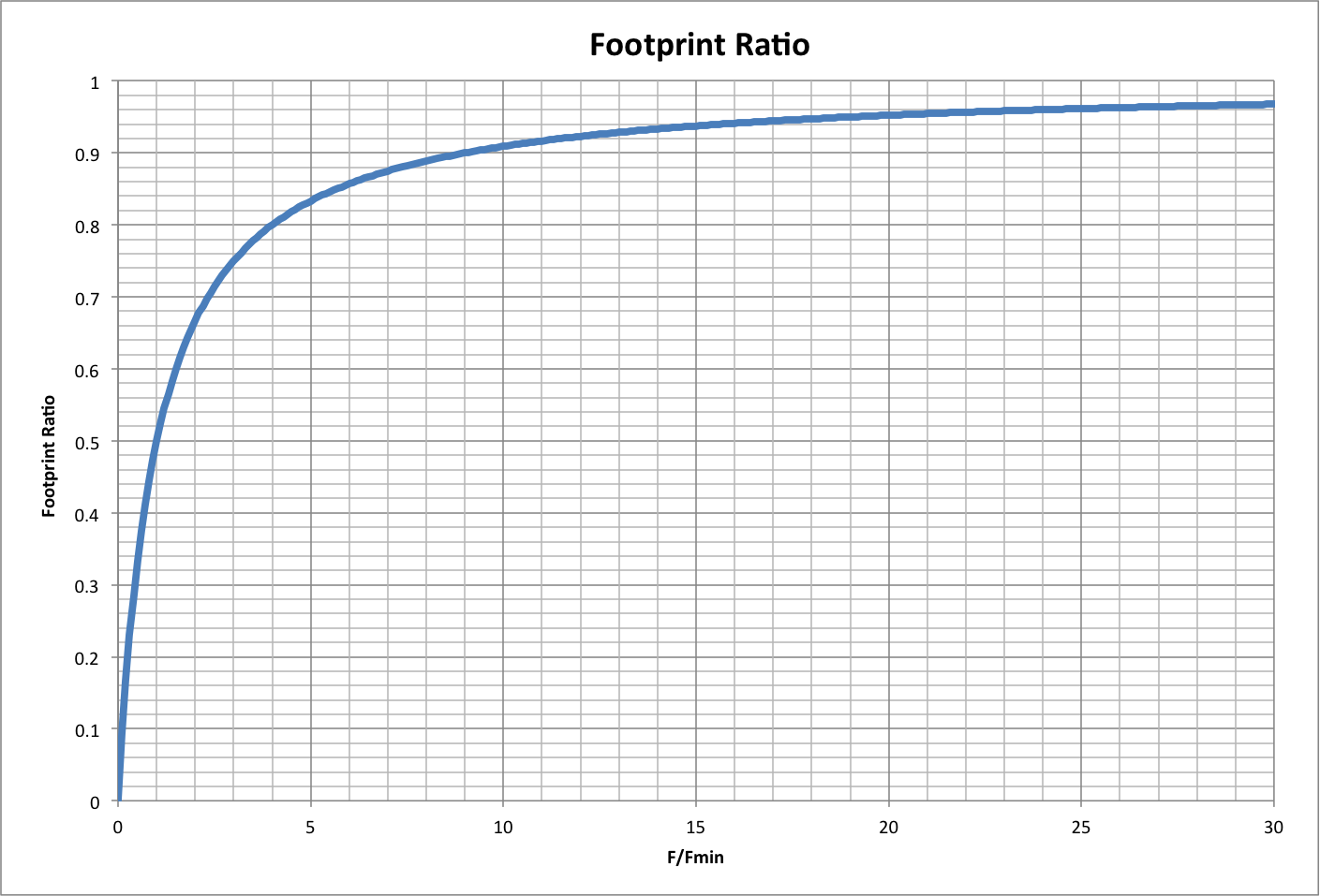
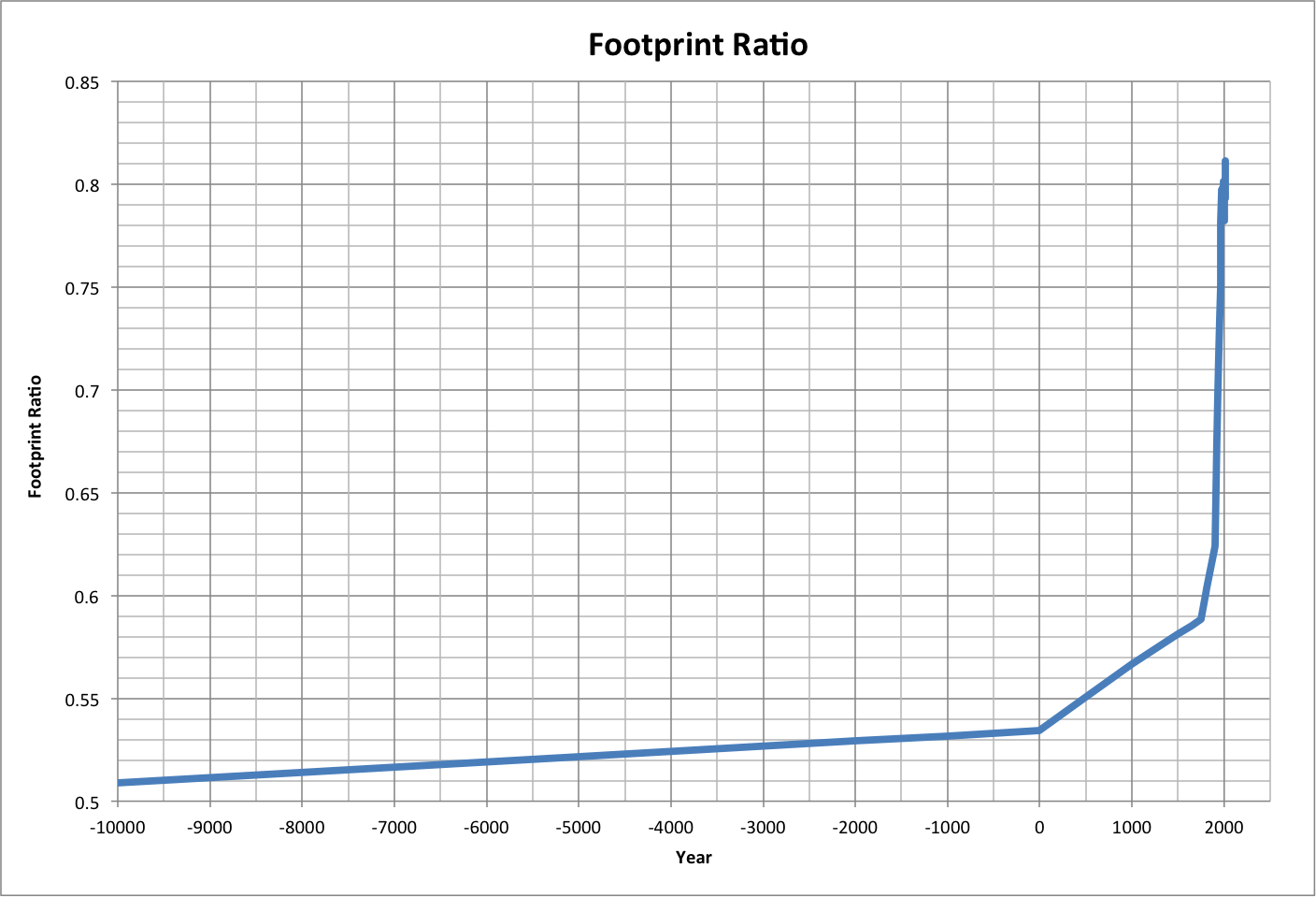
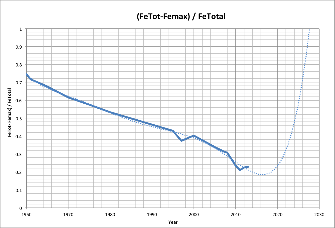
Using the Living Planet Index as a proxy for the total footprint available on Earth, FeTotal = 2.783 Earths/year, and the ratio of Fe to FeTotal is the fraction of the total used by humanity and what it requires for survival. This Femax ratio is graphed below as a function of the footprint ratio, using historical data for the years 10000 B.C. to 2013 A.D.
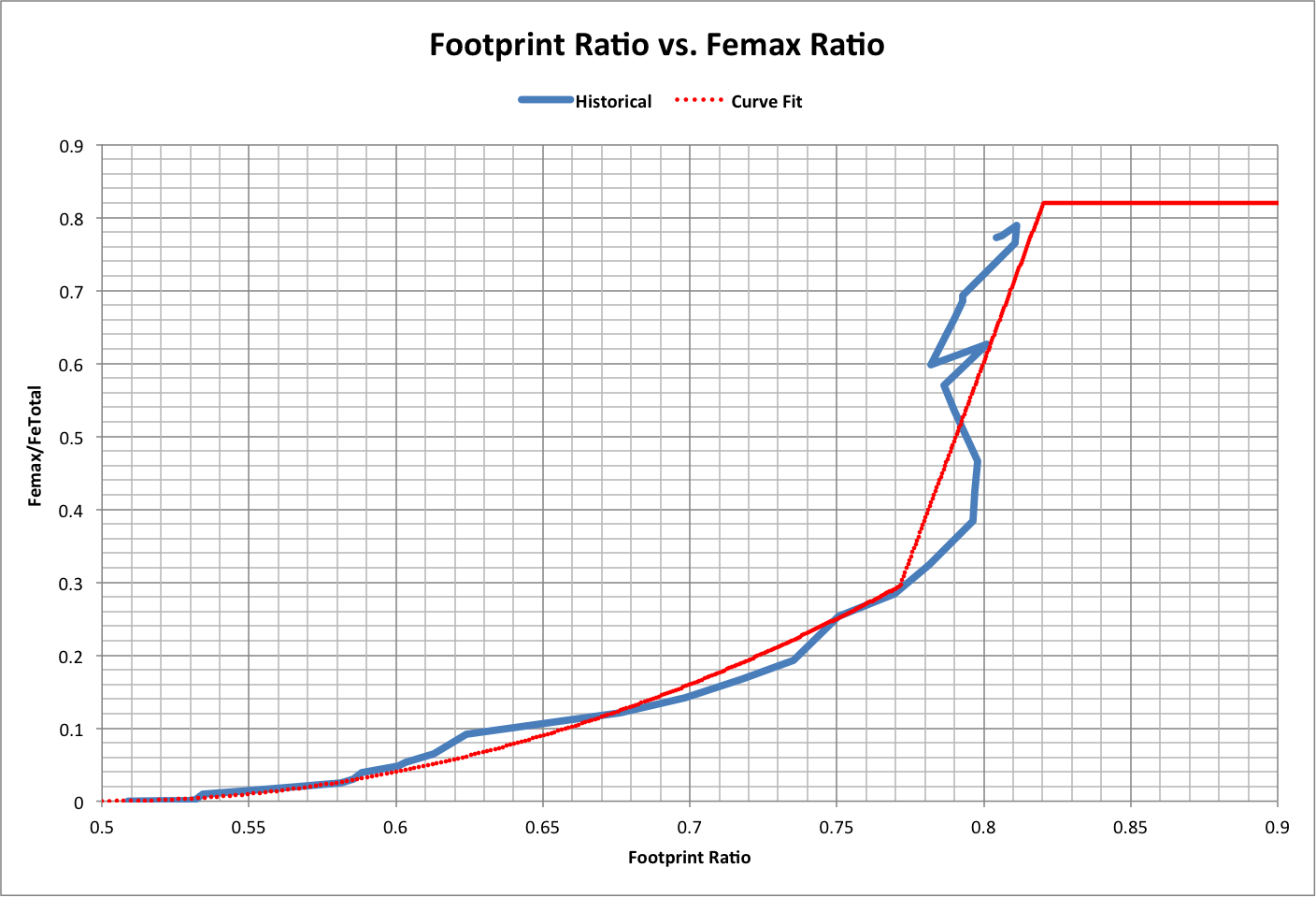
A function fitted to the curve (dotted line) has the following characteristics:
Femax / FeTotal = 4 * Fratio * (Fratio - 1) + 1, for Fe < 0.82
Femax / FeTotal = 10.748 * Fratio - 7.997, for Fe >= 0.82 and Fratio < 0.82
Femax / FeTotal = 0.82, for Fratio >= 0.82
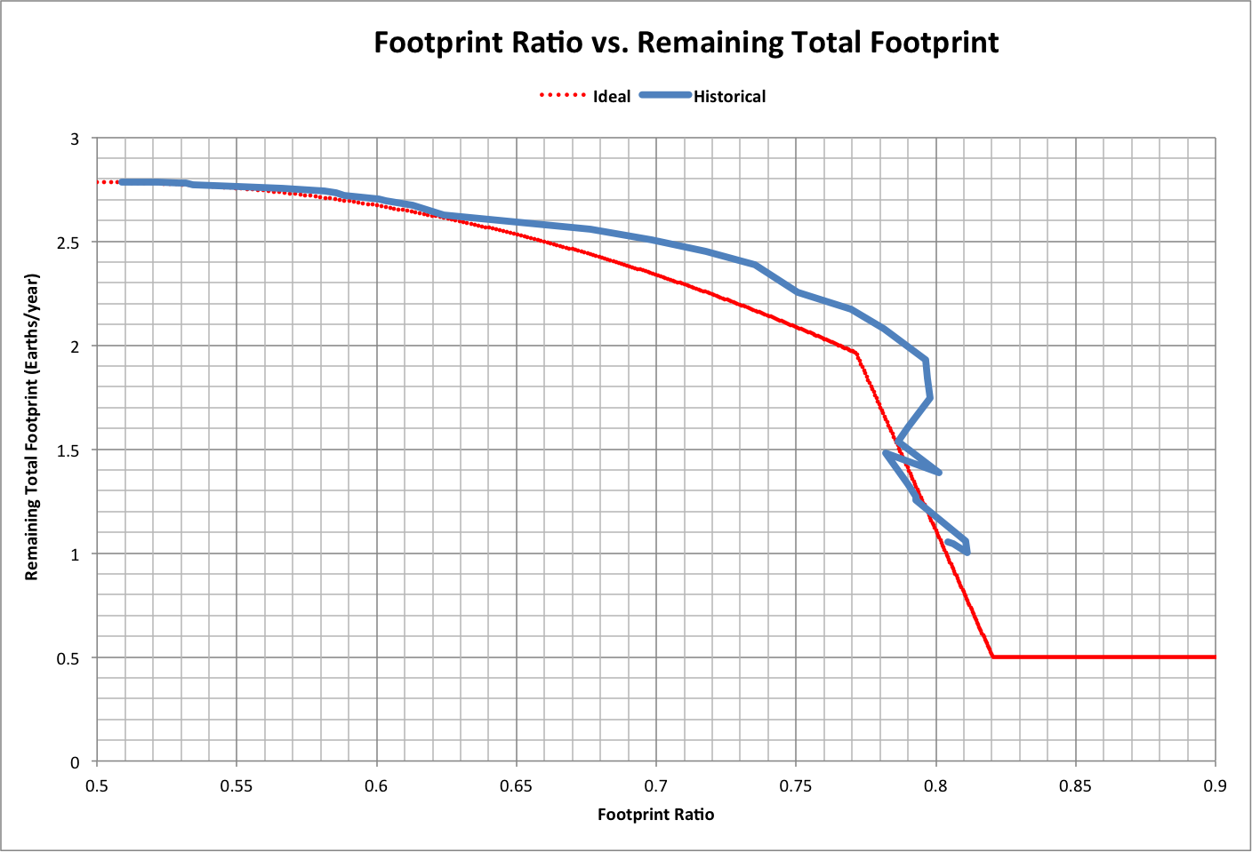
At Fratio = 0.82, the remaining total footprint FeTotal - Femax = 0.5. The following graph shows this value as calculated by the curve fit (Ideal) and using historical numbers:
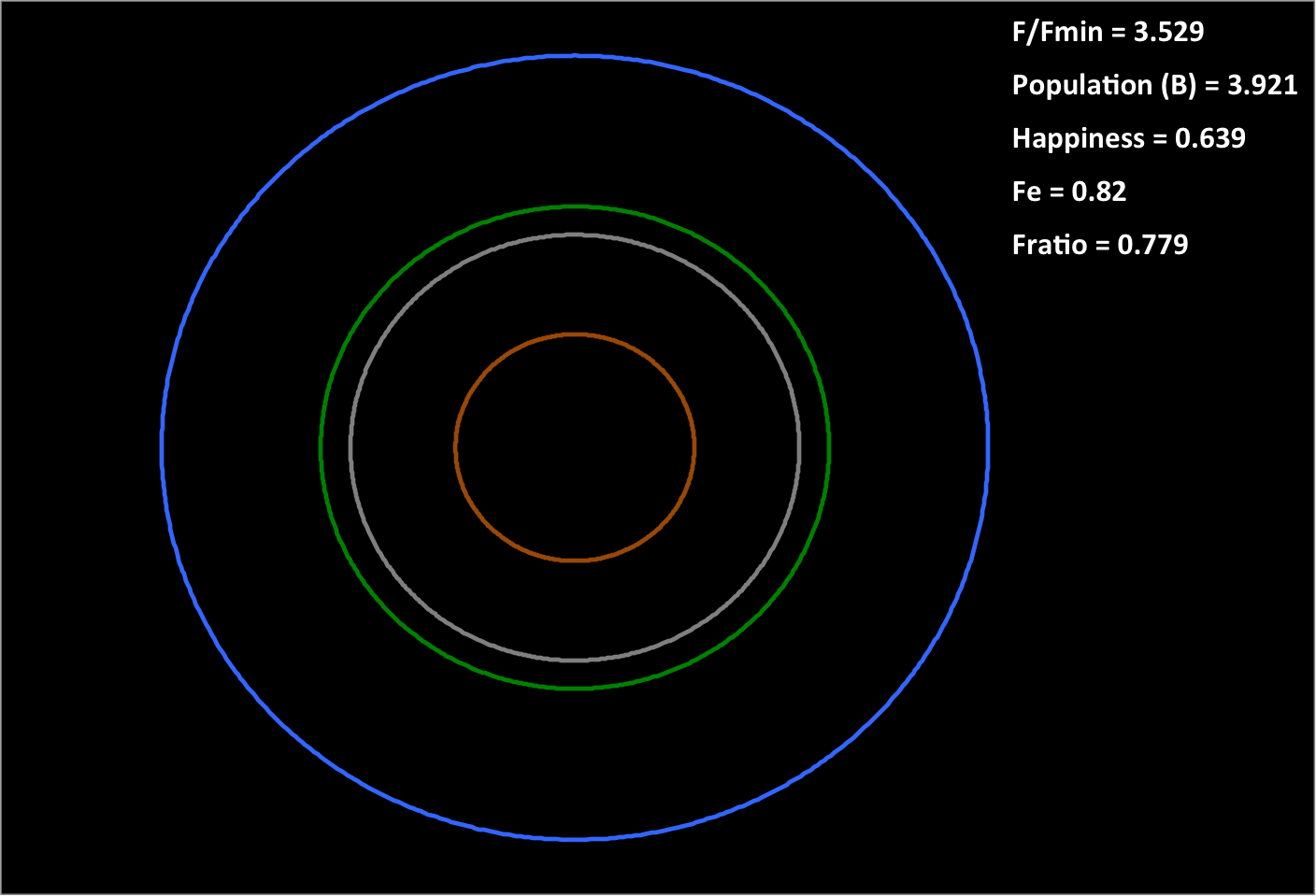
The following is a visualization of the Ideal:
- The center circle (brown) has an area proportional to the minimum total footprint of the population (Ppop * Fmin)
- Tthe next outer circle (gray) is Fe
- The next outer circle (green) is Femax
- The outer circle (blue) is FeTotal
The default image is for Fe = 0.82, and the roll-over image is for Fratio (F / Fmin) = 0.82.
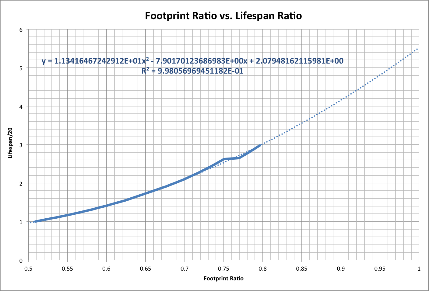
Note also that life expectancy varies with footprint ratio as a second-order polynomial, as shown below. The initial image is a projection using data up to 1970 (Fe ~ U). Roll over the image to see a projection for the full data set, out to Fratio = 1, using a sixth-order polynomial.
The first projection yields a maximum life expectancy, at Fratio =1, of 5.5 times the minimum (110 years). The second projection shows that the life expectancy peaks at 71 for Fratio = 0.82 and drops to zero by Fratio = 0.89.
The following updated analysis is based on new population data from the U.S. Census and life expectancy data from the World Bank. It also uses a corrected value for Fmin; the Fmin above was U times the correct Fmin, which should be b in the definition of happiness: h = F / (a * F + b).
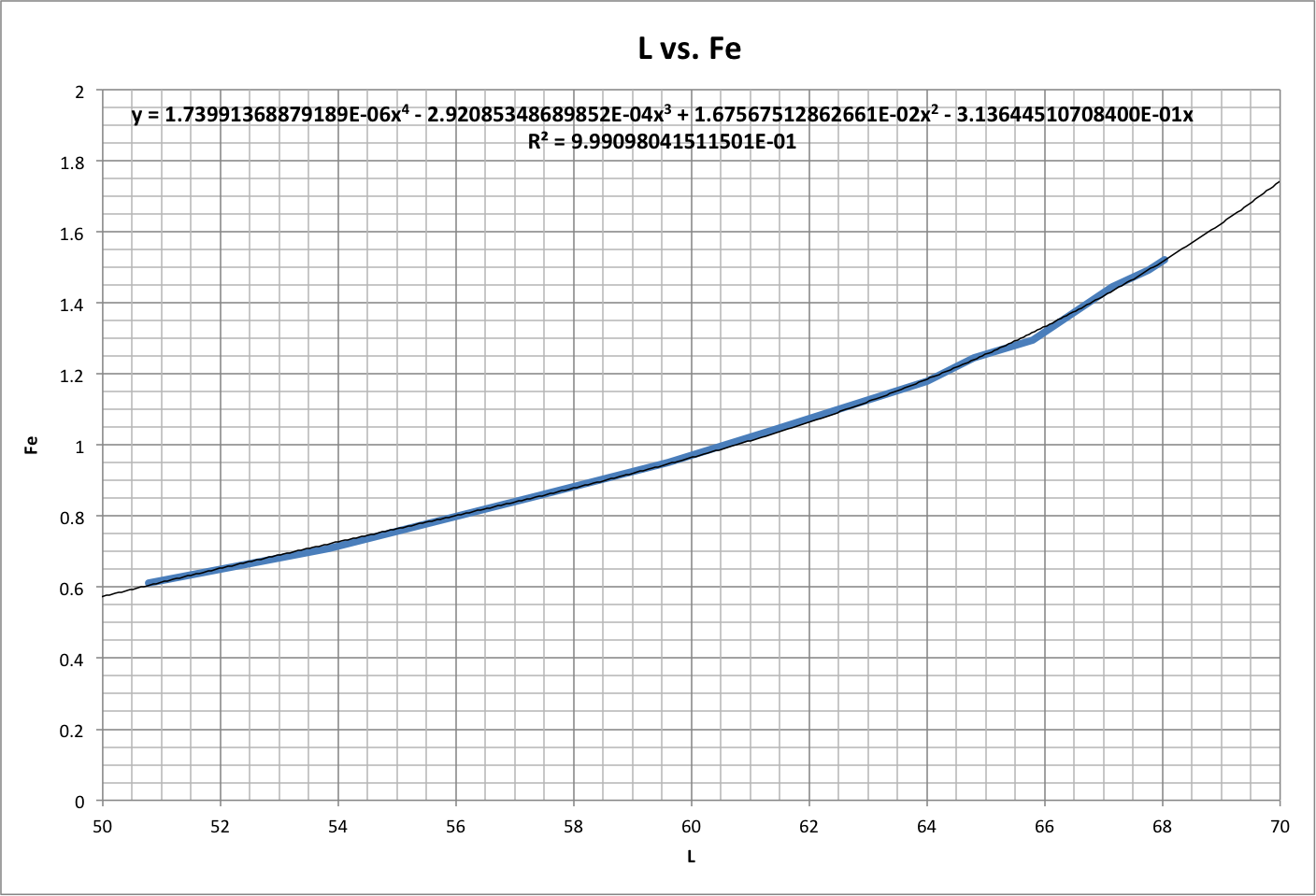
Global footprint estimates have also been improved based on the following correlation between life expectancy (L) and global ecological footprint (Fe) over the period 1961-2008:
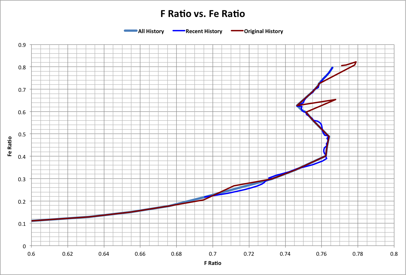
The results from original and present data sets are compared below, where F Ratio is the footprint ratio and Fe Ratio is (Fe + Femin) / FeTotal.
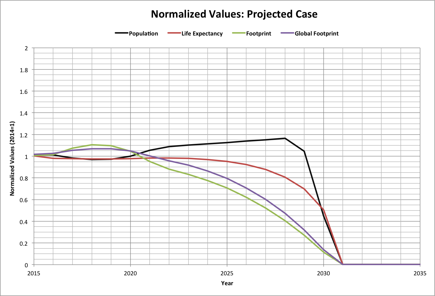
All History is the new data set, using the same years as the original data (Original History). New data from 1950-2014 in interpolated yearly intervals is displayed as Recent History.
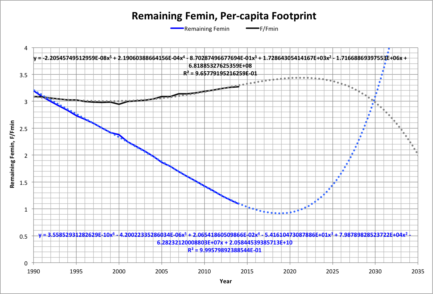
A closeup is shown below, along with the per-capita footprint as a multiple of Fmin. Also shown are curve-fit projections (dotted lines) for both variables based on data from 1950-2014.
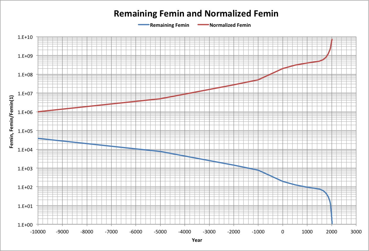
Note in particular that the critical point, where the population and supporters begin reducing the number of producers below the amount needed to feed the supporters, occurs where Remaining Femin = 1 which according to projections will be by April, 2016 (plotted data for each year is at mid-year).